UI customizations
Out of the box, an Alokai application ships with a default design system built on top of Storefront UI. While this helps ensure that your application looks good instantly, it's likely one of the first things you'll want to customize.
Since you have control over the storefront's code in either the Next.js or Nuxt application, you have access to all the code that can modify the look and feel of the application. This guide will walk you through some of the most common customization scenarios and will hopefully help you get familiar with the structure of the codebase.
In this chapter, you will:
- change the default logo to your custom one
- adjust the theme colors to suit the new logo
- add a pre-header with i18n
- customize the look of product cards on the product listing page
- add facet/filter search feature
In the end, your application will look something like this:
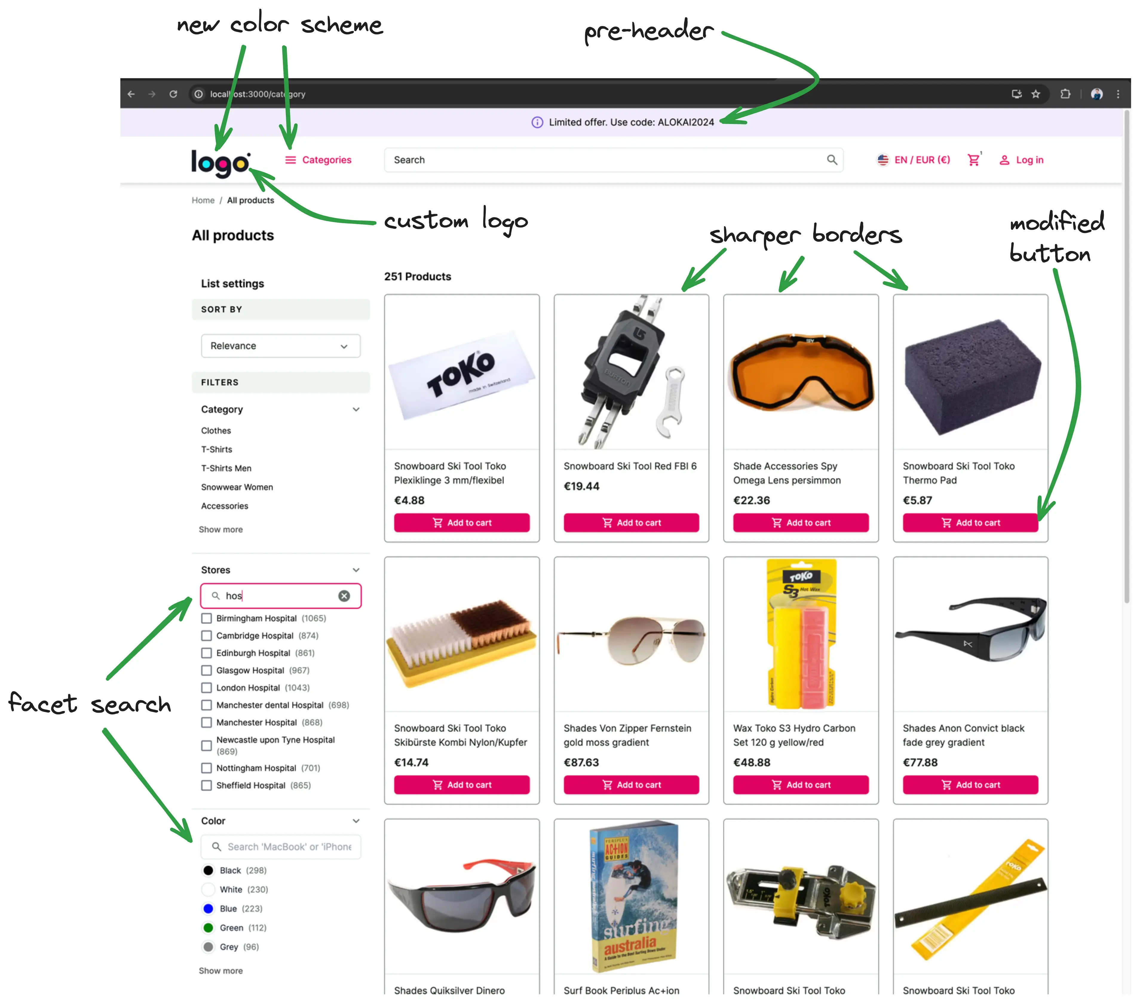
Changing the logo
The first step to making any changes is to identify what component is actually responsible for certain elements.
In this example, we need to find and modify the component that contains the logo. You can either:
- Drill through the Next.js application starting from
apps/storefront-unified-nextjs/app/[locale]/(cms)/[[...slug]]/page.tsx, which represents the homepage (actually all CMS pages). The layout for this page is located inapps/storefront-unified-nextjs/app/[locale]/(cms)/layout.tsx, which re-exportsBaseDefaultLayout. In that layout you can find thatNavbarcomponent is responsible for rendering the navbar. Within that component we haveNavbarTopcomponent which renders the logo. - Or you can use React Developer Tools to localize the component visually:
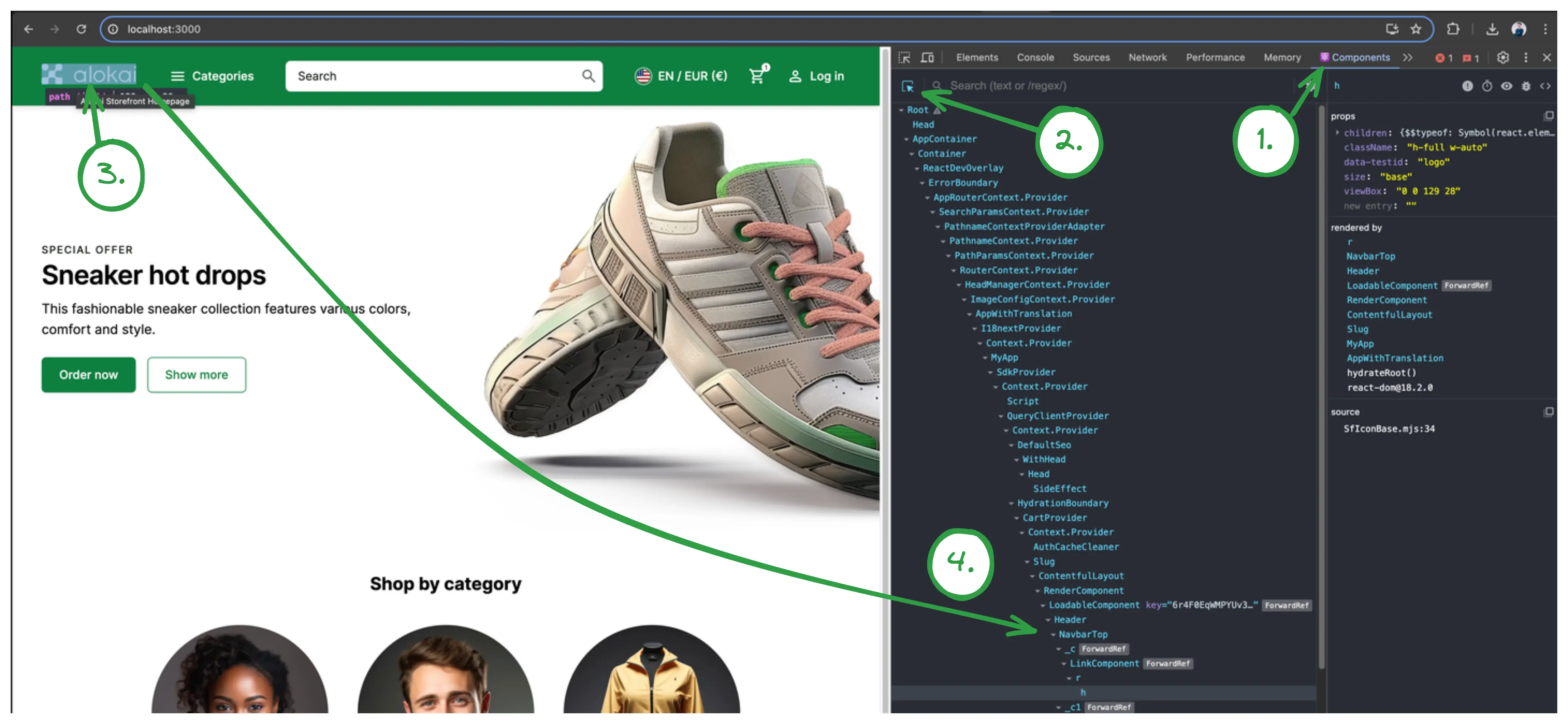
Doing one of these, you'll find that the logo is located in apps/storefront-unified-nextjs/components/navigations/navbar-top.tsx component.
Now, we have to change that component and replace SfIconAlokaiFull with your custom image. For this example, let's use LogoIpsum to generate a sample logo. Download a sample logo and place it in apps/storefront-unified-nextjs/public/images folder.
import { SfIconAlokaiFull } from '@storefront-ui/react';
import Image from 'next/image';
// ...
<SfIconAlokaiFull data-testid="logo" className="h-full w-auto" />
<Image src="/images/<logo-file-name>" width={100} height={50} unoptimized alt="logo" />
The result should look like this:
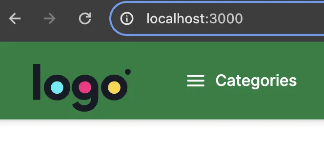
However, this logo doesn't look good on the storefront's default dark background. We can change that by removing the filled property from NavbarTop component in Navbar component. This will make the navbar use a white background instead.
- <NavbarTop filled>
+ <NavbarTop>
The logo should look better now. However, buttons in the navbar have become invisible. That's because they are white.
An Extra Challenge
Within the NavbarTop component, find which tailwind class is responsible for making the buttons white and remove it.
Adjusting theme colors
The default primary color does not play well with the colors in the logo. To fix this we will adjust our theme colors.
The Storefront uses Tailwind CSS v4 with the Storefront UI design system. Theme colors are defined using CSS custom properties via the @theme directive, so you can make large UI changes by overriding the color variables. If you don't have a color palette already, you can use Tailwind Colors to generate one. Note that Tailwind CSS v4 uses the OKLCH color space for its color palette.
Edit apps/storefront-unified-nextjs/app/tailwind.scss and add a @theme block to override the primary color palette:
@import 'tailwind-config/nextjs';

@source '../**/*.ts';
@source '../**/*.tsx';
@source '../../../../../node_modules/@storefront-ui/react';
@source '../../../../../../node_modules/@storefront-ui/react';

@theme {
  --color-primary-50: oklch(0.971 0.044 342.03);
  --color-primary-100: oklch(0.948 0.083 341.82);
  --color-primary-200: oklch(0.889 0.145 341.61);
  --color-primary-300: oklch(0.807 0.216 340.94);
  --color-primary-400: oklch(0.704 0.27 339.85);
  --color-primary-500: oklch(0.636 0.271 338.56);
  --color-primary-600: oklch(0.584 0.262 336.62);
  --color-primary-700: oklch(0.494 0.228 335.11);
  --color-primary-800: oklch(0.424 0.191 335.66);
  --color-primary-900: oklch(0.375 0.157 337.09);
  --color-primary-950: oklch(0.246 0.114 336.47);
}
The @theme block overrides Storefront UI's default color variables. You can override any of the theme variables including --color-secondary-*, --color-warning-*, --color-negative-*, --font-body, --font-headings, and more.
You can read more about theming in the Storefront UI docs.
Adding a pre-header
A common use case is to add a pre-header to the top of each page with something like promotional codes or a call to action. If you feel confident that you can do this, try it out before reading on.
Solution
- Create a new
pre-header.tsxfile inapps/storefront-unified-nextjs/components/navigationsfolder with the following content:
import { SfIconInfo } from '@storefront-ui/react';

export default function PreHeader() {
  return (
    <div
      className="flex w-full items-center justify-center rounded-md bg-secondary-100 py-1 pl-4 pr-2 shadow-md ring-1 ring-secondary-200 typography-text-sm md:typography-text-base"
      role="alert"
    >
      <SfIconInfo className="mr-2 shrink-0 text-secondary-700" />
      Limited offer. Use code: ALOKAI2024
    </div>
  );
}
- Add
PreHeadercomponent toNavbarTop:
export default function NavbarTop({ children, className, filled }: NavbarTopProps) {
  const t = useTranslations('NavbarTop');
  const messages = useMessages();

  return (
    <>      <PreHeader />      <header
        className={classNames(
          'sticky top-0 z-40 flex',
          filled
            ? 'border-neutral-700 bg-neutral-900 text-white md:shadow-md'
            : 'border-b border-neutral-200 bg-white text-neutral-900',
          className,
        )}
        data-testid="navbar-top"
      >
        <div className="sticky top-0 mx-auto flex w-full items-center gap-[clamp(1rem,3vw,3rem)] px-4 py-2 lg:px-10 lg:py-5">
          <Link className="-mt-1.5 h-6 md:h-7" data-testid="logo-link" href="/" title={t('homepage')}>
            <Image src="/images/logoipsum-332.svg" width={100} height={50} unoptimized alt="logo" />
          </Link>
          {children}
          <NextIntlClientProvider messages={pick(messages, 'Notifications')}>
            <Notifications />
          </NextIntlClientProvider>
        </div>
      </header>
    </>   );
}
Pre-header internationalization (i18n)
Let's make this example more interesting by making the pre-header localized. next-intl package comes installed in your storefront and is our recommended solution for internationalization.
- First, we need to add translations. Translation files are located under
apps/storefront-unified-nextjs/langfolder. There's a separate subfolder for each language (e.g.en,de). Open bothen/base.jsonandde/base.jsonfiles and add a new translation there:
},
+  "PreHeader": {
+    "promoText": "Limited offer. Use code: ALOKAI2024"
+  },
  "Navbar": {
  },
+  "PreHeader": {
+    "promoText": "Begrenztes Angebot. Verwenden Sie den Code: ALOKAI2024"
  },
  "Navbar": {
- Now, we can use the translations in our
PreHeadercomponent. We'll utilize theuseTranslationsfromnext-intlpackage. Yourpre-header.tsxshould look like this now:
import { SfIconInfo } from '@storefront-ui/react';
import { useTranslations } from 'next-intl';

export default function PreHeader() {
  const t = useTranslations('PreHeader');
  return (
    <div
      className="flex w-full items-center justify-center rounded-md bg-secondary-100 py-1 pl-4 pr-2 shadow-md ring-1 ring-secondary-200 typography-text-sm md:typography-text-base"
      role="alert"
    >
      <SfIconInfo className="mr-2 shrink-0 text-secondary-700" />
      {t('promoText')}
    </div>
  );
}
Modifying the product card on PLP
As a challenge, try to implement these design changes on your own by making the changes to the ProductCardVertical component.
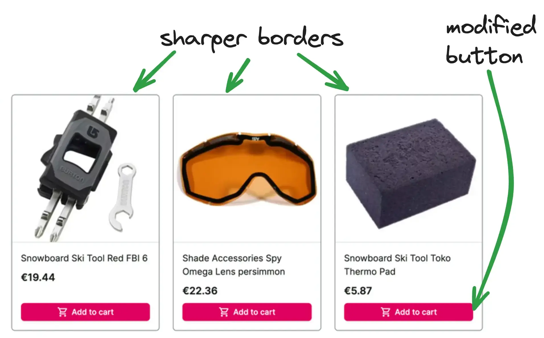
To check your solution, you can look at our implementation.
Facet search on PLP
Now let's try something more ambitious - we'll extend facet's (aka filters) behavior. We want to be able to filter/search through the facets.
Before jumping to the solution, think about how would you do this yourself. Investigate the application and which parts you need to modify.
Solution
- Under
apps/storefront-unified-nextjs/components/products-listingcreate a newFilterSearchcomponent that would be our searchbox. As a starting point, you can use Storefront UI's Search Block.apps/storefront-unified-nextjs/components/products-listing/filter-search.tsximport { SfIconCancel, SfIconSearch, SfInput } from '@storefront-ui/react'; import { useRef, useState, type ChangeEvent, type FormEvent, type KeyboardEvent } from 'react'; export type FilterSearchProps = { onSearch: (value: string) => void; }; export default function FilterSearch({ onSearch }: FilterSearchProps) { const inputRef = useRef<HTMLInputElement>(null); const [searchValue, setSearchValue] = useState(''); const isResetButton = Boolean(searchValue); const handleSubmit = (event: FormEvent) => { event.preventDefault(); }; const handleFocusInput = () => { inputRef.current?.focus(); }; const handleReset = () => { setSearchValue(''); onSearch(''); handleFocusInput(); }; const handleChange = (event: ChangeEvent<HTMLInputElement>) => { const ph = event.target.value; setSearchValue(ph); onSearch(ph); }; const handleInputKeyDown = (event: KeyboardEvent<HTMLDivElement>) => { if (event.key === 'Escape') handleReset(); }; return ( <form role="search" onSubmit={handleSubmit} className="relative px-4 py-1"> <SfInput ref={inputRef} value={searchValue} onChange={handleChange} aria-label="Search" placeholder="Search 'MacBook' or 'iPhone'..." onKeyDown={handleInputKeyDown} slotPrefix={<SfIconSearch />} slotSuffix={ isResetButton && ( <button type="reset" onClick={handleReset} aria-label="Reset search" className="flex rounded-md focus-visible:outline focus-visible:outline-offset" > <SfIconCancel /> </button> ) } /> </form> ); } - Modify
Facetcomponent inapps/storefront-unified-nextjs/components/products-listing/facets.tsxby addingFilterSearchcomponent and implementing filtering logic. Remember to add all the missing imports.apps/storefront-unified-nextjs/components/products-listing/facets.tsxfunction Facet({ containerClassName, expandableListProps, facet, itemRenderer: FacetItem, multiSelect = false, }: FacetProps) { const [searchPhrase, setSearchPhrase] = useState(''); const [values, setValues] = useState(facet.values); useEffect(() => { if (searchPhrase === '') { setValues(facet.values); } else { setValues( facet.values.filter((item) => item.label.toLocaleLowerCase().includes(searchPhrase.toLocaleLowerCase())), ); } }, [facet, searchPhrase]); const [selected, setSelected] = useQueryState( `${FACET_QUERY_PREFIX}${facet.name}`, parseAsArrayOf(parseAsString).withDefault([]).withOptions({ shallow: false }), ); function toggleFacet(value: string) { if (selected.includes(value)) { const updated = selected.filter((v) => v !== value); return setSelected(updated.length ? updated : null); } return setSelected(multiSelect ? [...selected, value] : [value]); } return ( <AccordionItem className="border-b border-neutral-200 pb-6" id={facet.name} key={facet.name} summary={ <span className="text-base font-medium capitalize" data-testid={`filter-${facet.label.replace(/\s+/g, '-').toLowerCase()}-heading`} > {facet.label} </span> } summaryClassName="pt-4" > <FilterSearch onSearch={setSearchPhrase} /> <div className={containerClassName}> <ExpandableList {...expandableListProps}> {facet.values.map((item) => ( {values.map((item) => ( <FacetItem key={item.value} {...item} onItemClick={() => toggleFacet(item.value)} selected={selected.includes(item.value)} /> ))} </ExpandableList> </div> </AccordionItem> ); }
You can find a complete project example in this repository: https://github.com/vsf-customer/extensibility-demo. If you want to get access to it, contact our sales team.